List of misc. UI Improvements
| Area | Requirement | Proposed by | Jira |
|---|---|---|---|
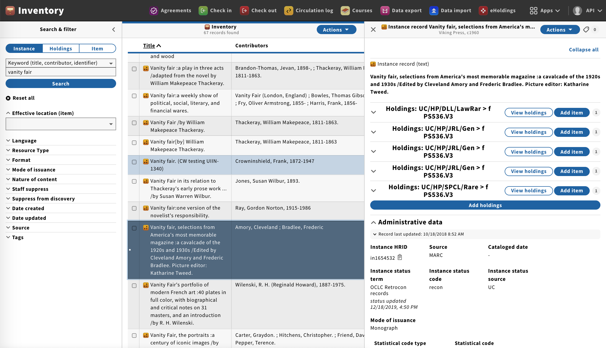
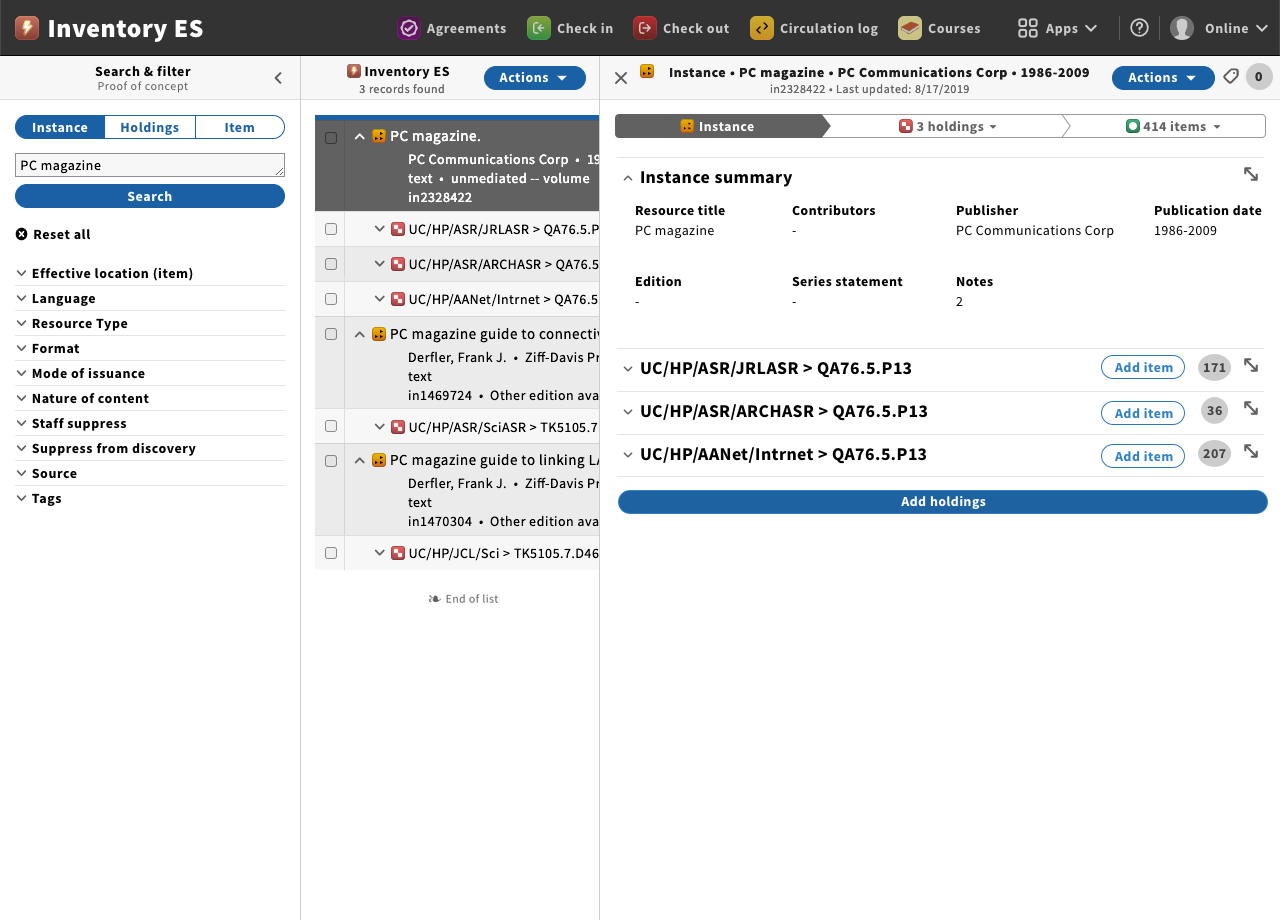
| Instance record. Display in full screen view | Besides the 3rd pane view, then have an action menu, or click able icon to quickly get the instance record displayed in full screen; similar to the view of the holdings and item record. Current display UX proposal: In third pane an 8Instance summary* (with short description of the instance). When clicking the icon for expand (double arrow), then the full view of the instance is displayed:
UX draft (full screen view of the instance, similar to the holdings and item): | This has been suggested by MM-SIG | UIIN-XXXX |
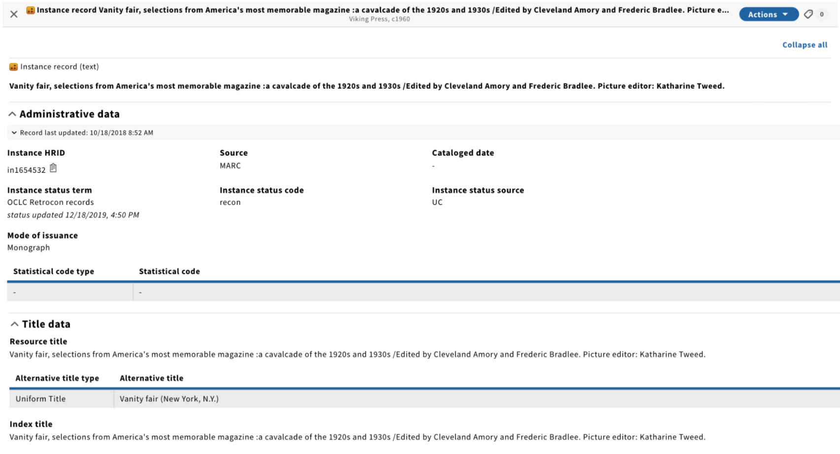
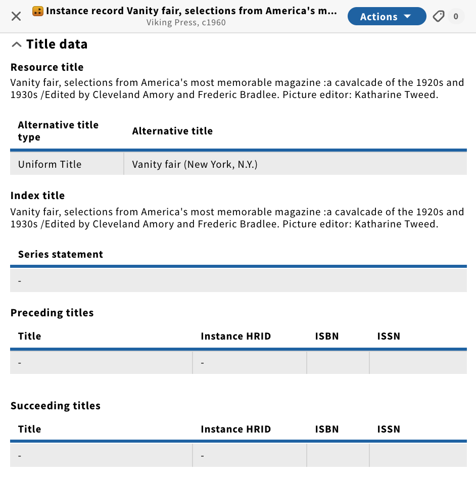
| Instance record. Title accordion | A harmonized display of the title data elements in the title accordion, whether it's:
Current display | UIIN-XXXX | |
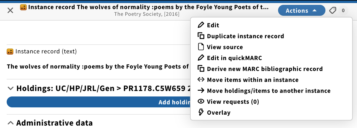
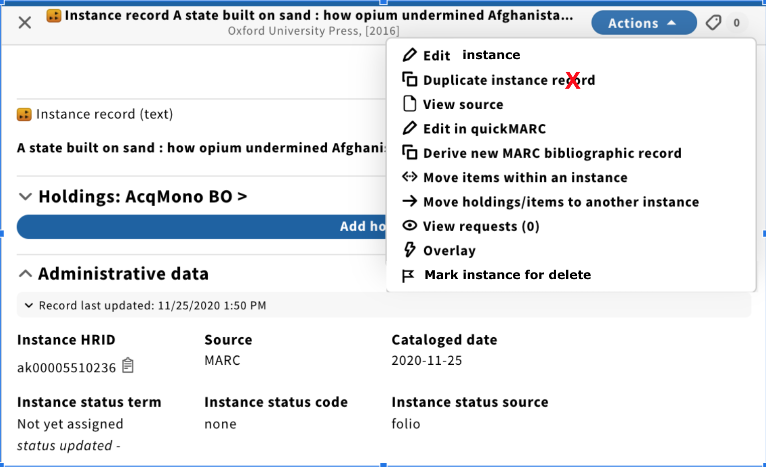
| Instance Actions menu | Can we structure the list of action items so it get's to be better organized. E.g. soon we also need to add Mark instance for delete and Delete instance: Current display: UX draft - should we also consider subheadings; e.g. SRS, and quickMARC? And more suggestions are being added by other teams; e.g. UIIN-1503 (Enable the Instance action menu to display Copyright Checker plugin actions). | ||
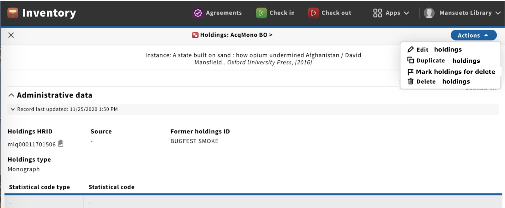
| Holdings Actions menu | Soon we'll have also the MFHD format editable in quickMARC, so possible several more Actions to be implemented. Current display UX draft - should we also consider subheadings; e.g. SRS, and quickMARC? | Charlotte Whitt | |
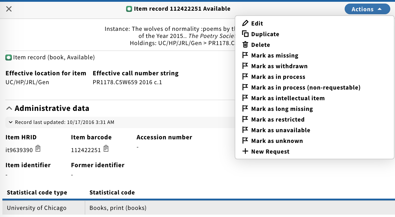
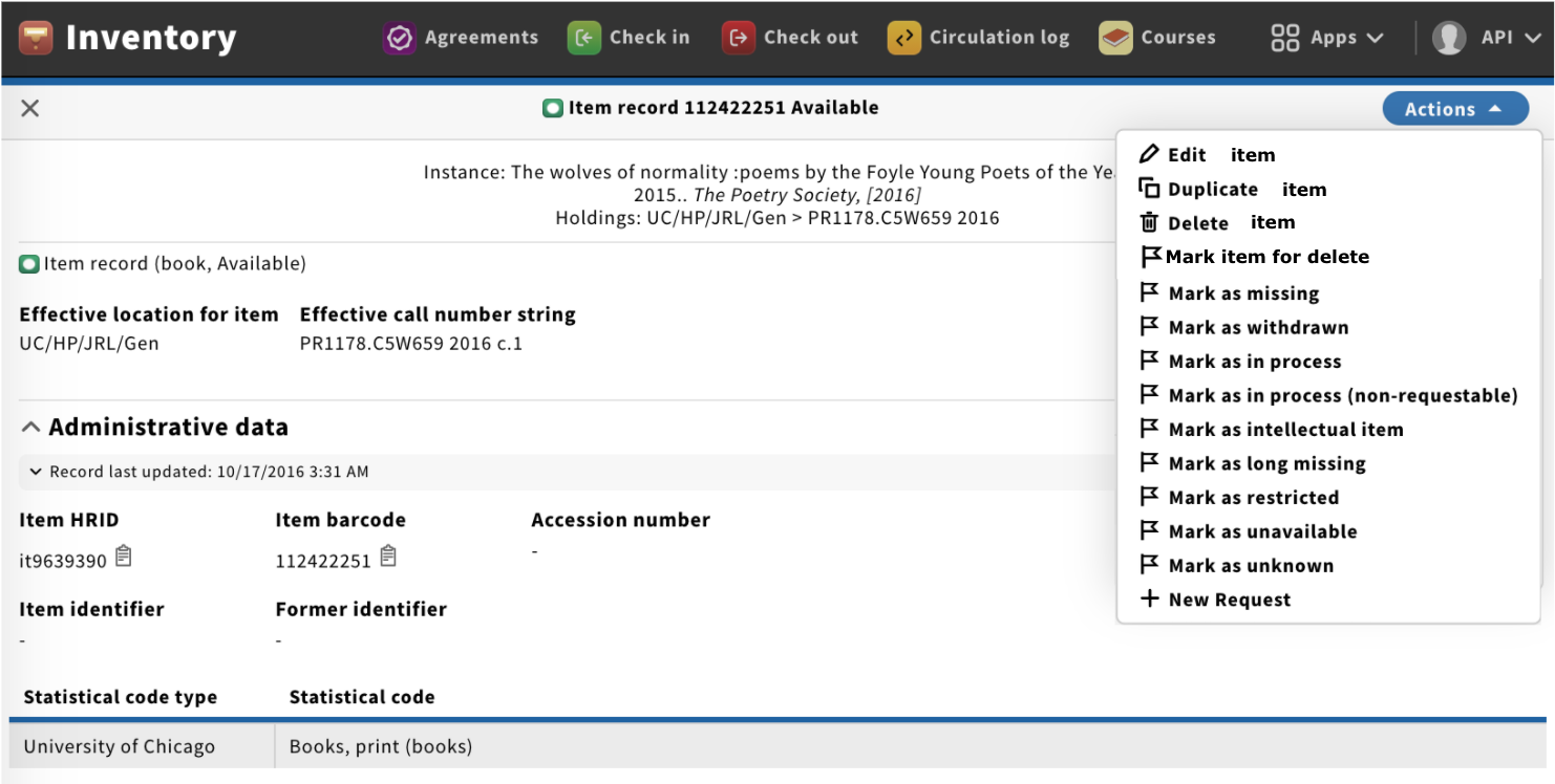
| Item Actions menu | Here we have e.g. many flag options for Item states. Current display UX draft - should we also consider subheadings; e.g. Item states, and Request? | ||
| Reorder items within the holdings | Can we maybe consider to deprecate this very old feature: UXPROD-1625 Order/sequence of items within a holdings record. Add and (manually) re-order Item records |
