2018-12-13 MARCcat Subgroup Meeting Notes

Date

Recording is available on: https://drive.google.com/file/d/1hIiS3c-Kv4PqtZF6V6w0VbTQnkHFFEa_/view?usp=sharing

Link to the zoom-meeting: https://zoom.us/j/119772606

Link to the wireframes: 

Link to the discussed document:

Discussion items


Item

Who

Notes


The last meeting before the holidays will be on December 13. After that, the next meeting will occur on January 10.
MARCcat UX/UI analysis
  • Double dagger - Keyboard shortcut, browser tabs and other little topics.

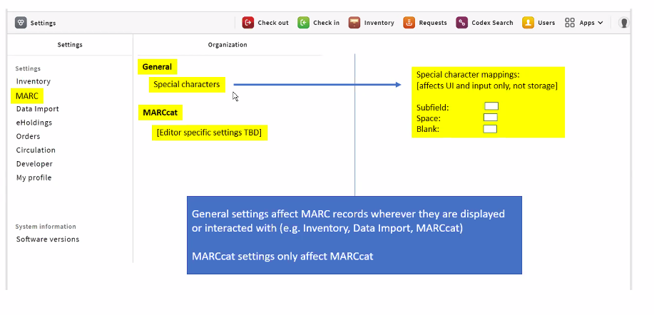
Proposal in for settings:

Jennifer suggested that this be a setting that is only available at a high level of permission: that a system administrator should only be allowed to define this setting.

Please share any suggestion or ideas that you have with Tiziana so they can take that into consideration in their development process.


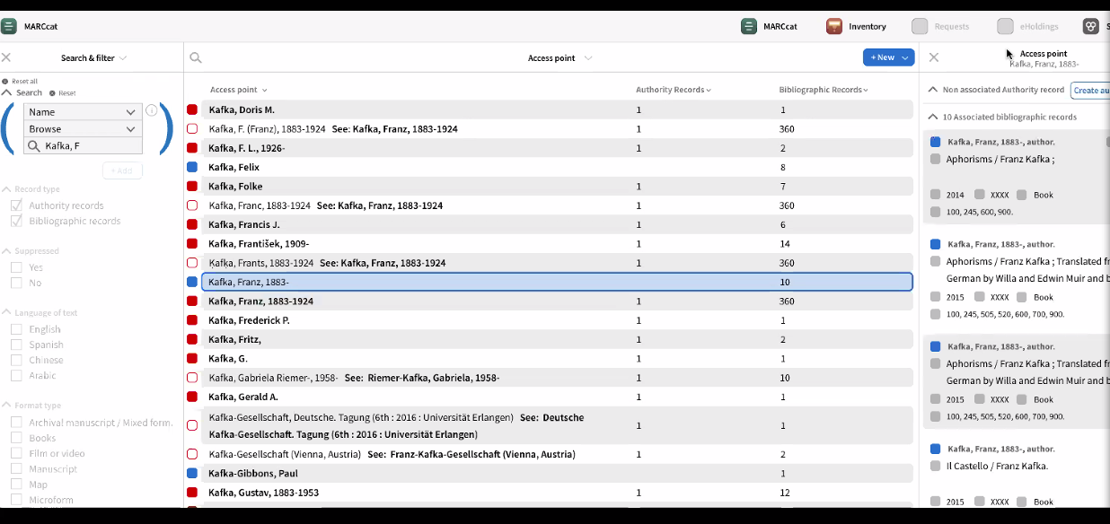
  1. Group agreed that "Access Point" is the correct heading on the right panel here:

  2. Question, via chat (from Colin):

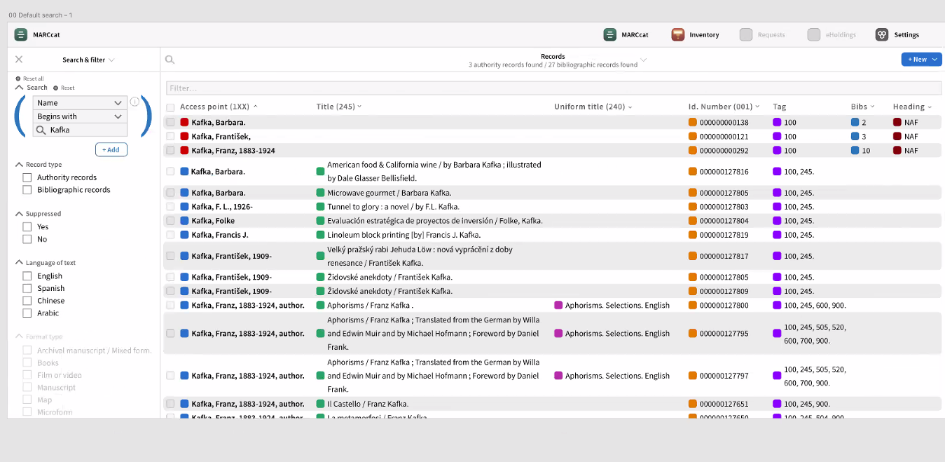
    "Hello all - no mic today. Question on filtering. If you have 1,000 results, will they be displayed on multiple pages? If so, will filtering show results across pages or will filtering only be applied to visible content?"


    Group feels the multiple icons in the screenshot below is "too much". Too many colors, too busy. Group likes red for authority, blue for bibliographic, however.
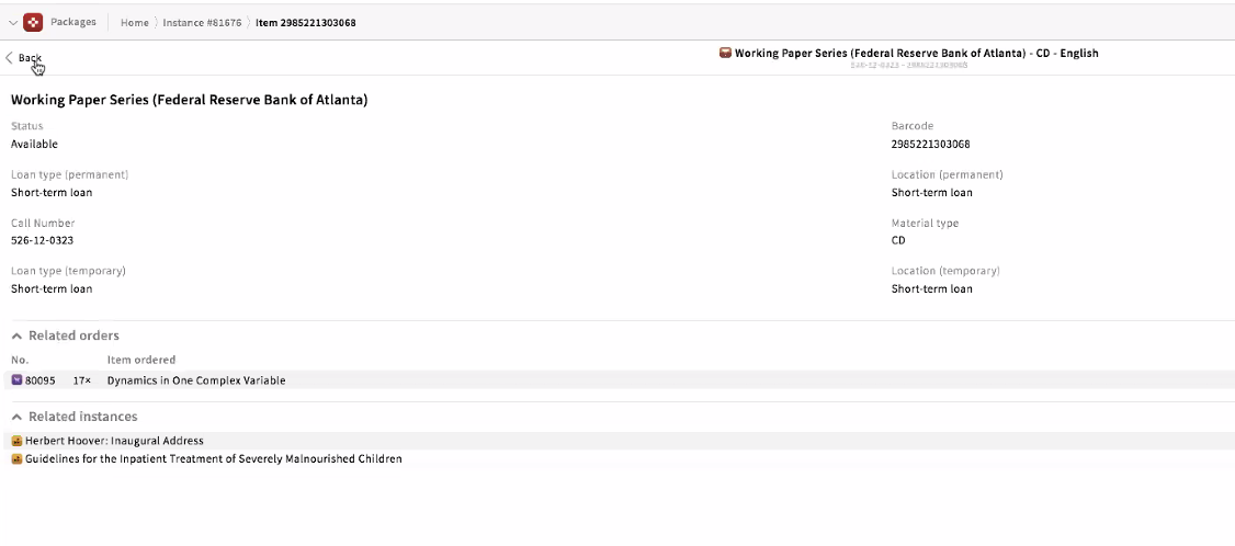
    3A. Breadcrumb option:

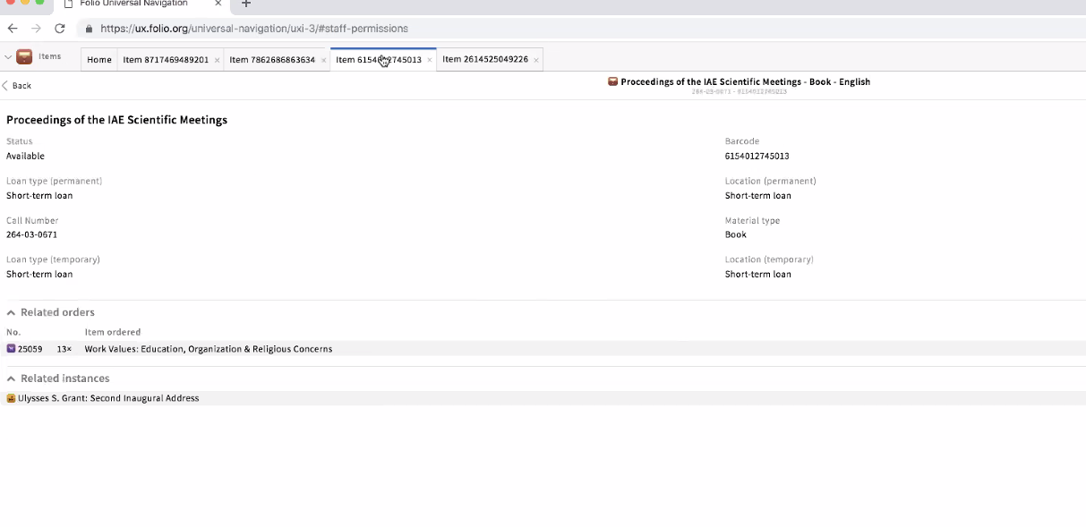
    3B: Multiple Tabs Option:

    The records in this example do not have to be related. The tabs will exist within the browser.


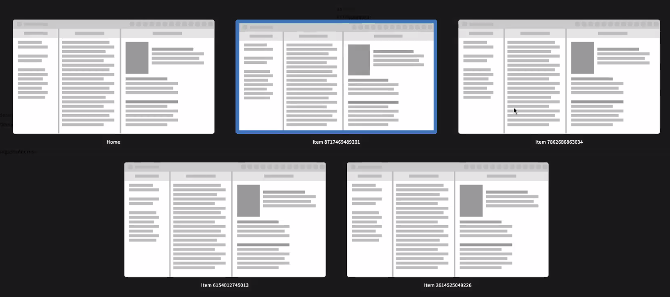
    3C. Screen previews:


    Votes:

    • Tabs and screen previews - positive reaction

    • Tiziana pointed out that the breadcrumbs serve a different purpose than the screen preview and tabs options. The "breadcrumbs" is not an actual hierarchy, it is a navigation option, showing the path you took to get there and come from there.


Notes


Attendees