Nolana scope update Features planned for Nolana: - UXPROD-3705 - Bulk Edit - User data - in app approach
- UXPROD-3712 - Bulk Edit - in app approach - loan types
- UXPROD-3704 - Bulk Edit - in app approach - holdings locations
- Possibly also: UXPROD-3713 - Bulk Edit - in app approach - item notes
Other features planned but delayed: Bulk edit will need to address existing dependencies and that will require additional work. The feature that was deprioritized by MM SIG: - UXPROD-3707 - Bulk edit - inventory items - csv approach
| - Magda: 13:29: Nolana scope updates--when we met last time I provided a few slightly different lists. So, what is left from what I was showing is bulk edit user data. In-app approach, we will be trying to add an in-app approach for users, so they are in the same pot as item records.
- Magda: 14:07: For Bulk Edit items, we will add support for loan types. We will also support holdings location similarly to the item location as we implemented in Morning Glory. The other features that are planned but delayed are the Bulk Delete inventory item records and delete user records.
- Magda: 14:40: After meeting with developers, they are extremely uncomfortable with the fact that not all the dependencies are being handled. First, in inventory, all of them are only handled on the UI. So, we need to recreate them. We also are not confident that all the dependencies are actually identified. You can live with this if only deleting one or two records manually. But once we started deleting hundreds of records, then this issue will be more visible and prominent. So, the development team proposes a separate approach, not soft delete, which means the record is marked as deleted, but still retained in the database, not hard delete, where the record is removed. The option proposed which is now on the table is called hybrid delete, which means the record is removed from the main table from the users or items, but it still stays in the temporary table stays there, as long as the user are well defined. So adding this temporary table and having the maintenance of this temporary table is adding to the scope of deletion. We will have a better understanding of how much more work it will entail probably by the end of this week once I meet with the development team and architects.
- Erin: Is there a wiki page?
- Magda: 16:58: It's not the wiki page just yet. There is a Google Doc. I will put this into the chat when I find it. I probably will not find it right now. I will find it. And I will post this on our Slack channel.
- Erin: 17:13: I guess I'm not sure why creating a brand new table structure is better than doing a soft delete.
- Erin: 17:35: I understand the reluctance about these features in general, like that makes total sense to me.
- Magda: 17:43: I think inventory is especially difficult. Because all the dependencies right now for manually deleting one item are in the UI. So first of all, we have to implement those on the backend. And then not all of them are implemented. So that is something that we would need to investigate as well.
- Erin: 18:16: Why is the assumption that Firebird would need to do that work versus Prokopovych? is it just like Prokopovych just doesn't have the capacity so Firebird needs to do it?
- Magda: I think no one has the capacity.
- Erin: 18:31: Well sure. But I just ...
- Magda: 18:37: I see Jenn's comment. It is the client's responsibility. When you say client Jenn, do you mean the software?
- Jenn: Yeah. Client Yeah.
- Magda: 18:50: So that this the system that is subscribing to the data. I disagree with this approach, to be honest. I fully disagree or partially disagree actually. But we can talk about this maybe during our next meeting, I would like to move on.
- Magda: 19:12: The last sentence about deleting item records, there is a parallel initiative that is related to marking inventory instances for deletion that depending on how it is implemented, we will need to adjust accordingly on our site as well. So more on deletion later, I will put the document in the slack chat after the meeting. This is still a work in progress. More about this probably during our next meeting.
Magda: 19:54: The other thing that was on our list when we talk last time was the CSV approach for items. However, MMC deprioritized it. They felt that they would rather invest time in the in-app approach because this seems to be the more desired behavior for MM SIG. - Magda: 20:53: So I added the comment to the feature if anyone is interested, I know some of you were interested in this, I think Sara. We not going to do it in Nolana. We will probably do it later, in a few releases. But at this point is not planned.
Magda: 21:30: There is one other feature that I hope we'll be able to squeeze as well in Nolana which is the item notes. It was mentioned at one of our meetings that once the location changes and the loan type changes, you would like to have the option of changing item notes. I will get a little bit more feedback about the requirements at the MM SIG meeting on Thursday and we'll see what we can squeeze in. Magda: Bob, go ahead, what was your question? Bob: 22:13: I just was wondering what Jenn meant by it's the client's responsibility. Jenn: 22:21: Sorry, I just meant...I'll put the issue in that we filed. We accidentally deleted some items via the API that had loans. When we complained that the API hadn't returned any errors, we were told that it was because the API is meant to let you do whatever you want. And it's your responsibility when you write your script or your bulk edit program to check the dependencies. - Magda: 22:44: I definitely disagree with this approach. The business logic should not be in the UI, the business logic should not be in the client's scripts, and the business logic should be handled consistently through FOLIO. So it should not matter if you're using the UI or you're using API, the behavior should be the same.
- Bob: 23:12: Thanks that clarifies that.
- Magda: 23:15: So what I just said is my opinion. And this is how we will try to implement it in Bulk Edit. I'm not saying that everybody in FOLIO agrees with this approach. Sara, go ahead.
- Sara: 23:34: So this is more back to the deprioritization by MM SIG. So just want to be sure I've understood correctly, it's not that it's off the table is just been pushed off without any kind of definite release in mind. So it is kind of an indefinite push off of bulk edit of inventory items via CSV approach is that correct?
- Magda: Yes. It is in the backlog. It's just not prioritized at this point. So definitely not for Nolana. Depending on the interest we will get from this group...and you're pushing for this functionality?
- Sara: 24:37: Yeah, I think it could be especially helpful if you want to have to do a large number of complex changes, like multiple changes, for example, loan type and temporary status. To me, it just seems like a much better way to handle this via the CSV file. So I do still advocate for this option in the longer term. But I totally understand that the in-app should come first. So I'm fine with that. I just don't want this to be one of those things that stays in the backlog for years.
- Magda: 26:13: So I agree with you Sara on this because we saw similar things happening in Data Export. We had stories that were pushed later, and we never had a chance to get back to them. Hopefully, we will have a chance to get to them. But they aren't prioritized. I also agree with you that CSV is a powerful tool and can help in special cases to simplify the updates for larger data sets or some specific data set. But this is not a tool for everyone. You have to be comfortable with the data set and be aware of the impact of the changes you are making. So more people will definitely be more comfortable with the in-app approach. So let's do the in-app approach. We will not be able to support all fields in the in-app approach. We will do the most commonly requested fields. And then the CSV approach will be the way to handle the cases when you would like to work with other fields. But this is something on our roadmap, not for Nolana, and most likely not Orchid. Okay, what I would like us to do, which is on our on my list to do once we do some work on the inventory, we will start working on some records from circulation and from acquisition then, so we can then start the building across app queries. But this is something that is starting to talk in the Orchid release or later.
- Magda: 28:18: Any question about the Nolana plans?
- Magda: 28:27: Then I will move to the feedback that we have received from UAT.
|
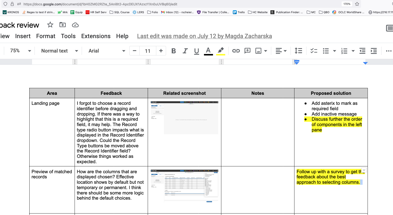
| UAT feedback review | - Feedback details: https://docs.google.com/document/d/1bH0ZMG2RZte_5Anl8t2-ApcDEUX1AzxzYXn0uUVBq60/edit?usp=sharing
- Magda: 28:38: But before we do this, I have a couple of questions for those who participated and those who did not participate. We got only four responses, which is definitely less than I was hoping for. I understand that the libraries were going live. There was a holiday and people were on vacation, and on top of that, there was the American Library Association Conference. I think to respond to the survey was probably half an hour of work, and I hope for our next UAT we will get better feedback with more responses. The feedback I got was awesome. People that responded provided a lot of very helpful information. So thank you very much for this. But I have a question for those that reached out to me for a login but never responded to the survey. Is this because of time constraints? Or did you run into issues that you were not able to overcome?
Lloyd: For me, it was just time at the library. You know, we're currently implementing folio right now. And things got pretty intense. And so I did ask for the login credentials. And actually, I started once or twice and then got waylaid. Magda: I understand that. I want to hear that to be sure it was something other than Bulk Edit. Because I'm concerned if it is just difficult to use for you. And if so, what else can we do? Lloyd: I don't think it was the result of the survey at all. It was just my time. Leeda: I would say it was just a combination of bad timing. Again, I feel bad because I was the one who pushed for two weeks. And then two weeks, couldn't cut it in this particular instance, but also my tendency, especially with a group of 15 to 20 of us, is to think, oh, somebody else's done it. That's just my bad habit. I can only promise to do better next time. - Ros: For me, it was a timing thing with going to ALA, and then we tested KIWI. I also had a new employee start, so I am stretched in other ways.
- Magda: There's one more person that didn't volunteer his side of the story. I'm not sure if we have this person on the call. I will reach out in a private message to get feedback.
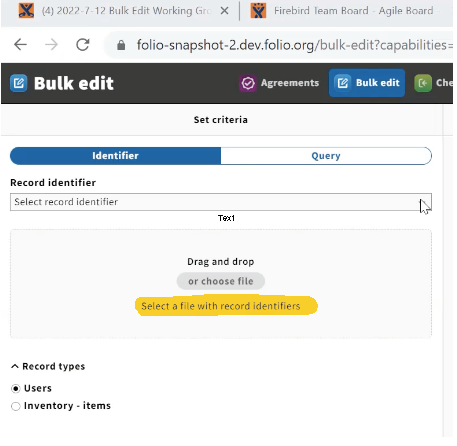
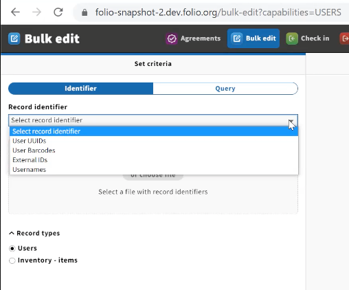
- Magda: Okay, so let's start with what was submitted, and I will go in the order of how the application progresses, not necessarily the order of the submitted responses. So the first comment is about the landing page and the fact that there is no indication you need to select a Record Identifier to move on because otherwise the file pick-up/drag-and-drop is disabled. And the other suggestion to move the record types selection above the drag-and-drop area is even higher. I do believe we talked about moving record types, and we decided to leave it as it is because it is consistent with other apps like data export, and import. But I do believe that that approach to move it up would make the flow of the mouse better on the screen. What do you think about that?
- Bob: I remember the conversation. And I think I think consistency just won out over what is a better UI design. I'm of mixed minds myself. But I would tend to leave it to keep things consistent.
- Erin: I tend to vote for consistency as well.
- Mark: I'm one that commented on this. It was driving me crazy. Because things were not where they needed to be. So I understand the consistency argument. But for me, the argument I'm going to make is the usability argument. It's enough to drive you batty. I would do things and they just simply would not work. Because the right things weren't selected. And maybe it's just me not paying close enough attention, but to me, it is a real usability issue.
- Magda: I have to admit that I agree with you. It annoys me, but only if I'm logged with both permissions that allow me to select between record types. Right now I'm logged into this environment with permission that gives me access only to inventory items. So the selection is done for me. The question I have for this group is, how often will users working in bulk have the permissions for all the apps?
- Erin: Maybe not all permission. But they might have clusters like users in circulation, inventory and orders, or something like that. So this won't be a problem.
- Ros: I agree with Erin about clusters of permissions.
- Erin: So Jenn is asking about where this pattern is elsewhere in FOLIO?
- Jenn: I'm just trying to understand what we're trying to be consistent with.
- Erin: I don't know if Kimmy is on the call or not might chime in and has thoughts on this...
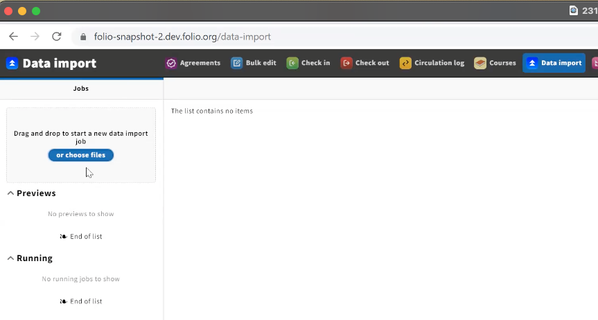
- Magda: So in Data Import, it's on the top, but you don't make any selection before the job here.

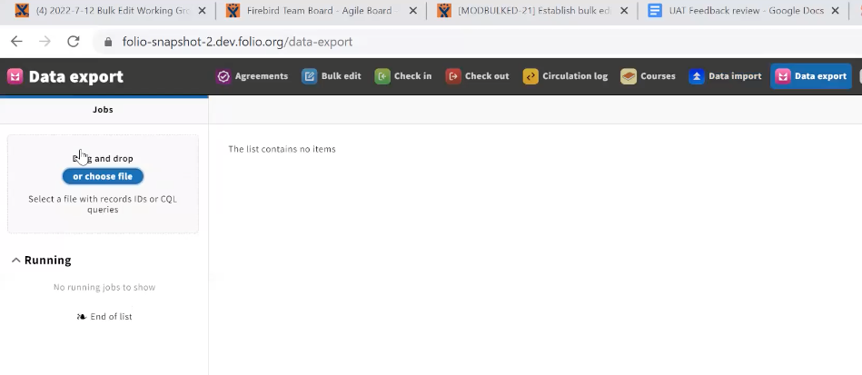
- Magda: In Data Export, is also on top here. But again, you don't need any selection before you start making that.

- Jenn: I don't see how either one of those relates to this.
- I think it's maybe more close to the pattern in inventory where you have the drop-down for what you're doing. And then you're searching kind of underneath it. I don't have a strong opinion about this. Is it sticky? I haven't played with this enough. You know, if it's a simple change, then maybe that's a UX win that can make this a little bit less frustrating.
- Magda: Do we have Kimie on the call?
- Erin: It looks like she's on the call.
- Kimie: I am. But I'm having some connectivity issues at the moment. So Magda, do we have to make a decision right now on this or can I talk to you?
- Magda: Yes, we can. We can come back to this.
- Magda: The other issue that Mark brought up, is that once you are on this form, you can try to drag and drop files but it doesn't tell you that you need to select the record identifier before you can drop a file. For me, it is pretty clear that the file drag-and-drop is disabled and you need to do something. And it states "select a file with record identifiers here. Maybe we should add the label here, select Record identifier, or what do you think? What would be the visual cue? For the user, that user knows that this is the first step?

- Sara: Can you open the drop-down menu to see all the choices?
- Magda: The choices in the drop-down depend on your selection record types, e.g., Users or Inventory. For Users, there are User UUIDs, User Barcodes, External IDs, and Usernames.

- Erin: So Kimie is saying in the chat that the Record Identifier should have an asterisk? Because that is required. I think people will understand that you have to choose something here.
- Magda: Okay, and we can easily we can implement this.
- Bob: Is there a way to have the system generate a message when you try to drop something on the file drag-and-drop window when it is inactive that says choose an identifier?
- Magda: Yes. The asterisk is definitely the easiest way. And once we do the asterisk, look for the output of a message if the user misses it.
- Magda: So proposed solution?
- Leeda, Erin, Jenn, and Mark: All agreed that moving the UI to display inputs in the order of operations would solve all the issues discussed.
- Magda: I wrote this in Yellow so we know we need to come back to this.

- Magda: The next issue was about what columns are displayed. We discuss this in March and agreed to this as a group. What are your suggestions? What would you suggest we do?
- Jenn: So this one was my comment. The reason I reacted to item effective location being there instead of the location fields, is that I cannot directly act on effective location. And it seems like I would want to see the columns that hold the values that I'm actually going to act on. I was trying to do an actual task, which was to change the location.
- Magda: So should we get together again, or I can put s survey together to ask what should be pre-selected and which one should be on the full list of options?
- Erin: I can't remember because like everybody else, my brain is soup right now. But did we ever do like a card sort exercise or anything else like that? That might?
- Magda: We did not. What we did, I think was sometime in March. I don't remember the date. But this was in March...
- Magda: I can I put together a survey, probably as simple a survey. And since we don't have a next week meeting, maybe you can provide your feedback.
- Erin: If you would like me to do that with Qualtrics.
- Magda: Awesome. Thank you.
- Magda: I can send you the list of the fields because obviously, there are more fields than there are here. And then we will discuss.
- Erin: Should the card sort be on the stuff that's here under show columns or is the card sorted on every inventory value?
- Magda: Should we stick to those fields? Or should we expand? What does the group think?
- Erin: The item record has a lot of stuff on it.
- Magda: Since we are discussing this again, maybe we should start from zero and see what the group thinks.
- Erin: OK.
- Jenn: I'll just say one other thing that was part of this feedback. This is the only opportunity you have to choose these columns. So even if you look at this, and you think it is fine. When I upload my file, it's changing say, the permanent location. When I get to that next screen, I can't make the location one of the columns. If the second screen could have a change so if I forgot to pick something then I can add it. Do you know what I mean?
- Magda: I know what you mean. But I think adding to the pick-list on the other screen would be difficult. I'm not saying it cannot be done. I'm saying it may be difficult, I think it would be easier to implement by making it consistent. So once you select your columns here, the selection persists through all screens, through the "are you sure" form and the confirmation screen.
- Jenn: Another option here is to go minimal on what's displayed and make it more obvious that you can pick things to add.
- Sara: I like Jen's first proposal of potentially adding the picklist to the second screen. But if that's more complicated, then I think forcing us to actually open it and select what we need. To see all the options and then make us choose what we need to include in this operation is the important thing. Because actually, the effective location is really important to have in combination with all three location fields if that is what you're focused on. For example, if you're controlling your permanent location from the Holdings Record, the item actually says none for the permanent location. And so putting the permanent location there would be kind of nonsensical as a default. You would still have to open it and add more. So I like the idea of going minimal and really just forcing you each time to choose what you need for this operation right now. Let me check off what I need and be forced to make that decision, so to speak. I don't think that's a burden.
- Magda: We will come back to this once we have feedback from the survey, and we either will do the way Jenn volunteered with a Pick List organizing the fields. I also like the option of the bare minimum displayed on this screen. But the question is, what would be the bare minimum? Do you want to have only barcodes? Or what do you want to have to be displayed? And I do believe this would also vary from scenario to scenario depending on what feelings are you planning to update.
Unknown Speaker 21:27
just looking at that list and I will save the bare minimum have a barcode and item HR ID, then I would like something that kind of prompts me so I don't panic. That's that. That's all I can see. They say please choose please select more columns here or something. Unknown Speaker 21:50
Yeah, I would say that too, is kind of like that identifier field, we need something to say select fire record, or whatever. You know, something that prompts it being up in the Actions menu is actually really far away from just that one thing in the middle degree. Unknown Speaker 22:11
Can you repeat? Unknown Speaker 22:14
So So when I'm looking at the screen, right, I have file name up top, and then I have preview of record match. And then I have errors. But the Action menu is really far away from indicating to me that this is how I select the columns, you have record matched. And just like we were saying that over for set criteria for record identifier, it just being blank is not helpful. It actually needs to kind of indicate to us it needs to prompt us by saying select Record identifier or whatever it was that we just agreed on, to prompt you to drop down in what you need to select. So it's almost like preview of record match needs also some kind of like little indicator select from fields. Like I was just speaking. Unknown Speaker 23:02
So KIM Yeah. So Kimmy saying in the chat, you know, we could just put a note that says Choose Columns under the Actions button. So you add some text there. I guess the reason I'm kind of feeling not great about this, these proposals is I think more that I would be more comfortable with it. If I felt like I could choose it, and then it would stick. In other words, I don't want to do this every single time I'm coming into the app, and dealing with user thing. So we get to the idea of like user fully renewed the user profile system, which it doesn't have right, to be able to save like my local customer preferences and things. So I just I do feel like the order of what is there make sense? In some contexts, it doesn't make sense in every context, but there are some contexts where it does. I think Sarah's point about the fact that sometimes the location fields are completely blank is also very valid, right? You know, and that may have been part of where we were when we were first talking about the list. What we could do is we could do a cart sort for all the columns that are listed. We could do a card sort for every field and inventory if we wanted to do that. And then we could do a question that says, What would you consider to be the bare minimum? And just, you know, choose these values, and we can see what comes back? Unknown Speaker 24:37
I thought the show column approach is consistent with other apps. I'm picking inventory because that's where I spend most of my time, but I know this is the behavior also in other places as well. So I would not expect this to be so I'm expected, I would say that if you don't see what you want to see, you would naturally go to action menu to select the columns. Unknown Speaker 25:14
And probably MACRA, you are absolutely right. We're all new to the system. We're all getting into the system. So we haven't been using it enough to realize that we're going to be being trained by each app to do certain things and to look for certain things in certain places, right? We're still learning where things live. Like, right now, I would say I would never have thought to click on Actions to find that information, you know, to find more things to add, but asked me in a month, probably it's the like, the first thing that comes to mind, oh, yeah, just click there and, or an ad that, I will know that. But we're also Unknown Speaker 25:54
I understand that this is a new product for you. But the approach of selecting columns is not specific. The behavior for bulk edit it is, Unknown Speaker 26:07
it's a UI pattern that's across Unknown Speaker 26:11
kind of likes the right my, my programmed reaction from our current system is to go to the ER and right click, but I don't see enough columns, you know, right click, and then the then this very show columns thing shows, is something to get used to. Unknown Speaker 26:31
I think this is just a different approach, because your current systems probably not what web base you are, you're talking to the client. And so I let me put in the user feedback is that we will follow up with the survey. Unknown Speaker 27:38
The next was about the record. This is important, and we have five minutes left, but maybe we can start talking about this. So this is the same file that was used by the person who provided the feedback, this feedback, and here's the behavior. The file contains 15 entries. Two of them are errors. So though, there are no matches for those two identifiers, so the 13 records that much the list here does not contain 13 Records much. The idea of the preview is to show Top 10 records. And the the way we discussed it, if you want to see more, you do the download master records, and you select and you'll see this in the CSV file. If this is not clear, and it needs to be readjusted, let's talk about this. Do you think the number of 10 is insufficient? It shouldn't be more if it's insufficient than how many would would satisfy the need. The other thing is, there is a bug right now because there is 32 it should show at least 10 is showing nine. So I find I found the back for this to find out why we are getting on the nine instead of instead of 10 The one thing that I don't I did not understand from the from the comments is about 11 marched with two errors. So was this day font file, or if the person who submitted it can provide a little bit more feedback, if they understand that that would be awesome I will reach out to the person directly. Let's go back and question of the preview |
